Quality control refers to a company's methods for assessing product quality and, if necessary, improving it. There are various ways to perform quality control, including benchmarking, examining manufacturing procedures, and testing products. All of this is done to keep track of significant product differences.
Types of quality control
1. IQC:-
Incoming quality control
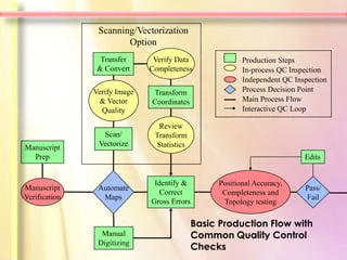
This is a process of checking and comparing the parts, products and material purchased from vendor and some of out sources as per our organisation quality standards.
2. IPQC:-
In process quality control
In this method we do the inspection of parts during manufacturing process. During parts getting manufactured . For example if we are manufacturer a shaft on a cnc machine and there are 5steps to complete it the we will check all the dimensions after a single operation. To achieve the desired accuracy.
3 Final Quality
Quality assurance
This is a process of quality assurance of final goods which we have after completion of all the process or operations. In this method we assure that all the processes do properly and all the parameters are as per requirement.
What are the necessary tools we use to analyse the whole process
When it comes to quality control, there are 7 QC tools. These are important techniques used across various industries and their origins start from Tokyo University from Professor Dr Kaoru Ishikawa.
7 QC Tools Definition
7 QC tools are a set of graphical data representation and problem-solving techniques. These seven basi jic quality tools are integral to any process improvement methodology, including Six Sigma, total quality management (TQM), etc.
They help in troubleshooting a variety of quality-related issues. By doing so, any business can create a better strategic quality management plan and improve the customer experience.
7 QC Tools List
The 7 QC tools were introduced by Kaoru Ishikawa, a Japanese professor, in his book Guide to Quality Control (1976). According to Dr. Ishikawa, these simple tools can solve 90% of quality problems in a company.
These basic tools of quality require introductory-level knowledge of statistics. They are easy to understand and use, compared to advanced statistical methods such as hypothesis testing, regression analysis, etc.
Control Charts 📉
The control chart was first invented by Walter A. Shewhart in the 1920s, and it also goes by the name, Shewhart chart.
It is a type of graph that shows how to interpret the change in information through time.
In a control chart, you will see that it contains a line at the centre. This determines the average or the mean value of a quality characteristic.
Then there are lines above and below this average. And they are known as upper and lower control limits, signifying a threshold at which the output is either controlled or affected.
Graphs or Flow chart 📈
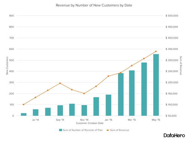
As part of the 7 QC tools, graphs are basic representations of data with specified value units along the horizontal and vertical axes. In the Guide to Quality Control book, the author mentions different types of graphs for different purposes.
For instance, a bar graph can be used for comparing the different sizes of data. For representing changes in the information, you can use line graphs.
Also, note that graphs are also mentioned in a variety of online resources (when you Google “7qc tools”) as stratification or flow charts. Stratification is about interpreting unexplored patterns from separated data.
Check Sheets 📝
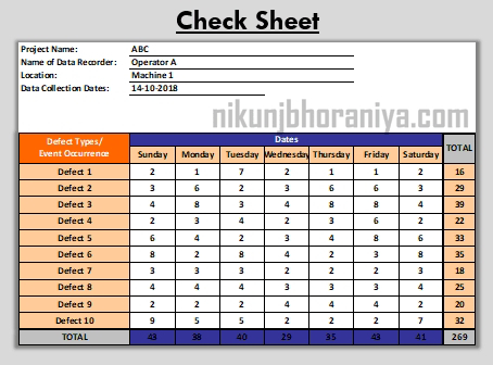
In his book, Dr. Ishikawa emphasises the importance of collecting correct data with a clear purpose. According to him, the consequent problem is making that data ‘easy to obtain and use’. He then refers to check sheets, which are among the easiest and fastest ways to compile and analyse data.
In any given check sheet, you will see the data is represented as a check or a tally mark. Each check mark shows the number of times the value occurs. While it can cater to many purposes, it is primarily used for collecting data on frequency distribution for histograms and other charts.
Pareto Diagram
The Pareto diagram is another bar chart that is also referred to as a type of histogram. But what differentiates it from others is that you can know which quality problem should be prioritised first.
In the Pareto chart, you will see that the horizontal axis represents the number of items with defects. To the extreme left, there is the tallest bar, and it keeps becoming shorter as you move to the right. The vertical axis shows the number or the causes of defects with each item.
The Pareto chart works on the Pareto principle that is also known as the 80-20 rule. According to this principle, 80% of the problems (consequences) come from 20% of causes. So, you can safely say that the Pareto diagram helps you understand and work on the relative factors that have the most impact. Dr. Ishikawa mentions that it should be the ‘first step to making improvements.’
Cause and Effect Diagram
Also known as the Fishbone or Ishikawa diagram, it helps in finding the root causes or factors of any problem. The Fishbone diagram is represented as fish bones representing different categories/causes such as equipment, materials, manpower, processes, etc.
Under each of these categories, you can branch out into sub-lists so that you accurately know what aspect is causing an effect.
See how it works as a 7 QC tool with
Histogram
A histogram is used for arranging and analysing collected data. It is the representation of the variations, or what Dr. Ishikawa refers to as dispersion and averages.
The histogram is able to show any defect from different groups of numerical data in the bar graph form. The groups or classes are represented as bars on the horizontal axis, as shown above. While the variations/frequency of data appears along the vertical axis.
Through a histogram, it becomes easy to interpret data from different groups. Then it becomes possible to remove defects and improve product quality.
Scatter Diagram
A scatter diagram is also called a scatter plot. This statistical tool is used for showing the relationship between two variables. You can find positive or negative correlations with this type of diagram.


No comments:
Post a Comment